Creating a calm and peaceful environment at home can significantly improve your comfort and well-being. One of the easiest and most effective ways to achieve this is through your choice of colors. Calm colors help reduce stress, promote relaxation, and make your space feel welcoming. If you’re considering refreshing your home’s look with a tranquil vibe, here are some useful tips for choosing calm colors that work beautifully in any room.
Why Choose Calm Colors?
Calm colors are typically soft, muted tones that don’t overwhelm the senses. They include shades like soft blues, gentle greens, warm neutrals, and light grays. These colors can:
– Create a soothing atmosphere
– Make spaces feel larger and more open
– Help improve focus and relaxation
– Coordinate well with natural materials and textures
Understanding how colors influence mood can guide you in making choices that enhance your living space.
Understanding Color Temperature and Its Effect
Colors generally fall into two categories: warm and cool. Both can be calming depending on the shade.
– Cool colors like blues, greens, and lavenders tend to have a relaxing effect. They remind us of nature, such as the ocean or forests, which helps create a peaceful vibe.
– Warm colors like soft beiges, light browns, and muted yellows can add coziness without being too stimulating.
When choosing calm colors, consider balancing these temperatures to suit your room’s lighting and function.
Tips for Choosing Calm Colors for Your Home
1. Start With a Neutral Base
Neutrals provide an excellent foundation for calm color schemes. Shades of white, cream, gray, or taupe allow other colors to shine without overpowering the room.
– Choose a neutral wall color and add accents with calming hues through furniture, décor, or textiles.
– Neutral tones also give you flexibility for future decorating changes.
2. Consider the Room’s Purpose
Think about how the room will be used. Different spaces benefit from different calming tones.
– Bedrooms often work well with soft blues or pale greens to encourage rest.
– Living rooms can embrace warm neutrals or muted earth tones for a welcoming atmosphere.
– Home offices may benefit from light gray or gentle greens to improve concentration without feeling dull.
3. Test Samples in Natural Light
Color looks different depending on the lighting in your home.
– Paint test patches on your walls and observe how they look throughout the day.
– Natural light will highlight the true tone, while artificial lighting can alter the warmth or coolness.
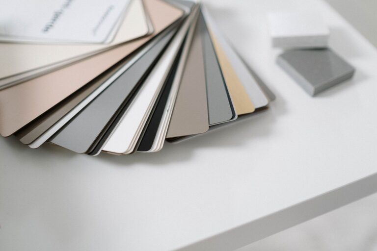
– Avoid choosing colors based only on small swatches or online images.
4. Avoid Overly Bright or Saturated Colors
While vibrant colors are energizing, they are less ideal for creating calmness.
– Stick to soft, muted versions of your preferred colors rather than intense or neon shades.
– Pastels or colors with added gray or white tend to be more soothing.
5. Use Color Combinations That Flow
Pairing calm colors can amplify their effect.
– Monochromatic schemes (different shades of the same color) provide a harmonious look.
– Complementary colors (colors opposite each other on the color wheel) can work if you choose soft tones, like pale blue and warm beige.
– Analogous colors (colors next to each other on the color wheel) such as soft green, blue, and teal create a natural, coordinated feel.
6. Incorporate Natural Elements
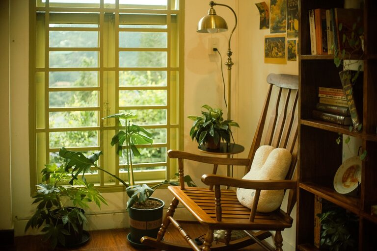
Natural materials like wood, stone, and plants complement calm colors beautifully.
– These textures add warmth and depth to your color palette.
– Greenery also introduces life and freshness that enhance a tranquil environment.
7. Consider Finish and Texture
The finish of your paint can affect how calm a color feels.
– Matte or eggshell finishes look softer and reduce glare, which supports a relaxing vibe.
– Avoid shiny finishes for walls in rooms meant for resting or unwinding.
Popular Calm Colors to Explore
Here are some timeless calm color options to consider:
– Soft Blue: Evokes the sky and sea, known for its calming influence.
– Muted Green: Reminiscent of nature, perfect for balance and tranquility.
– Warm Beige: Creates a cozy yet neutral environment.
– Light Gray: Modern and versatile, pairs well with many accent colors.
– Lavender: A gentle mix of blue and purple, promotes relaxation.
– Dusty Pink: Adds a subtle warmth without overwhelming the space.
Final Thoughts
Choosing calm colors for your home doesn’t mean you have to settle for bland or boring. Thoughtfully selected muted colors can create spaces that feel inviting, peaceful, and balanced. By understanding the mood different colors evoke and how they interact with light and furnishings, you can design a home atmosphere that supports relaxation and joy every day.
Start with small changes if you’re unsure—pillows, rugs, or curtains in calm tones can gradually guide your space toward a more serene feel before committing to a full room makeover.
With these tips in mind, you’re ready to pick calm colors that are just right for your home!